Composer
I designed the AI interface for the Klaviyo - the swiss army knife of components
Component Architecture Modular Design Systems Thinking Technical Specification Cross-functional Collaboration
Challenge
Composer needed clearer cross-team design direction, stronger consistency across content surfaces, and validation through research before broader integration.
My Role
Lead component strategist and component architect for the high-impact AI Composer component.
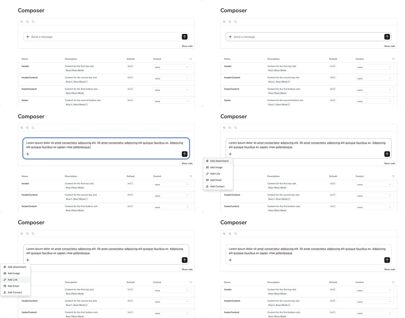
Primary designer and SME responsible for defining a zone architecture and leveraging React node slots for plug-and-play flexibility.
Solution
I owned the design direction for autonomous marketing composer across content surfaces, partnered on cross-team design consistency, maintained prototypes, and ran user research to refine the experience. By working closely with other designers and engineers, I was able to deliver a hyper-flexible component that could evolve to fit many user needs, from chat interaction to AI image generation.
Impact
My work supported launch readiness and live integrations, while my research surfaced adoption signals from over 7 user tests. The AI feature acceptance rates ranged from 32% to 70% depending on workflow, proving that the component was recognizable as an agentic interface with potential to be expanded beyond its original requirements.
Composer
A high-impact component to modernize user interaction with AI technology, specifically for editing and command functions.
Usage guidelines
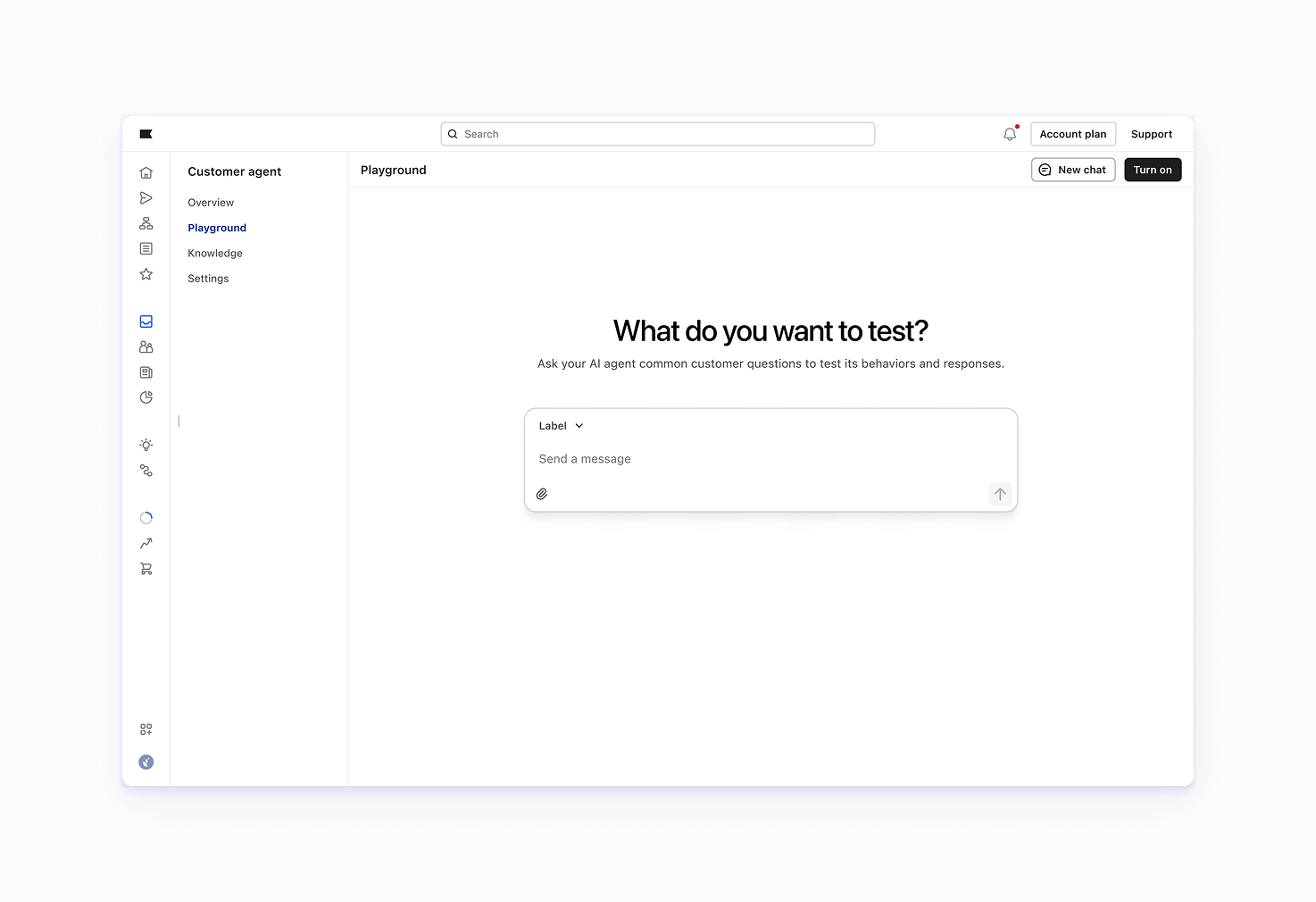
Prominent Composer: Elevated, full-width, or hero-style placement for primary AI tasks.
I designed this as the baseline component that is both responsive and flexible enough to accommodate most LLM scenarios.
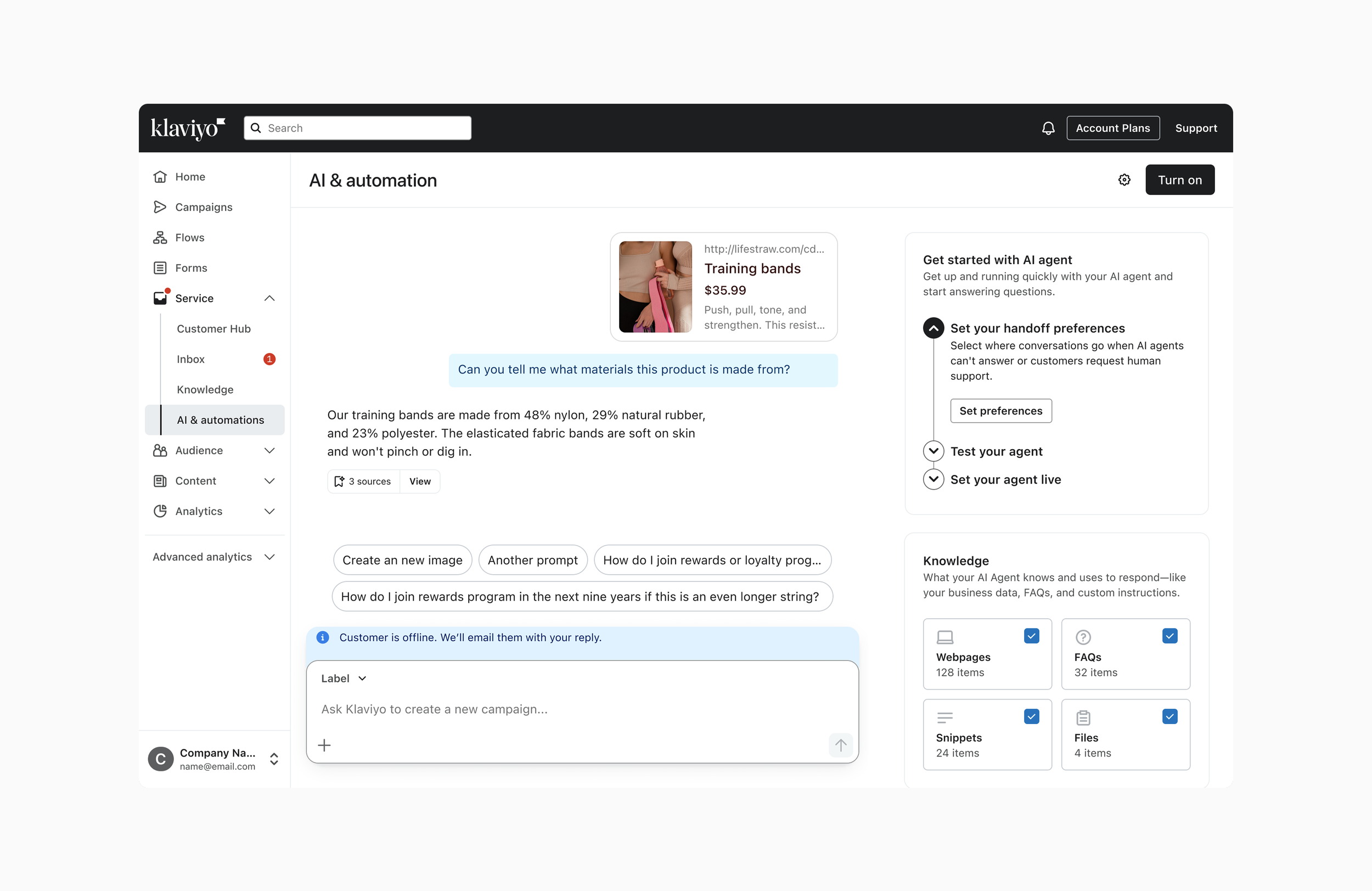
Inline Composer: Embedded within a page or panel.
One of the advantages of using a slot architecture pattern and a modified Notification banner is that the Composer can be modified without major customization.
I stress tested it in my local environment it with Cursor before handing it off to engineering.
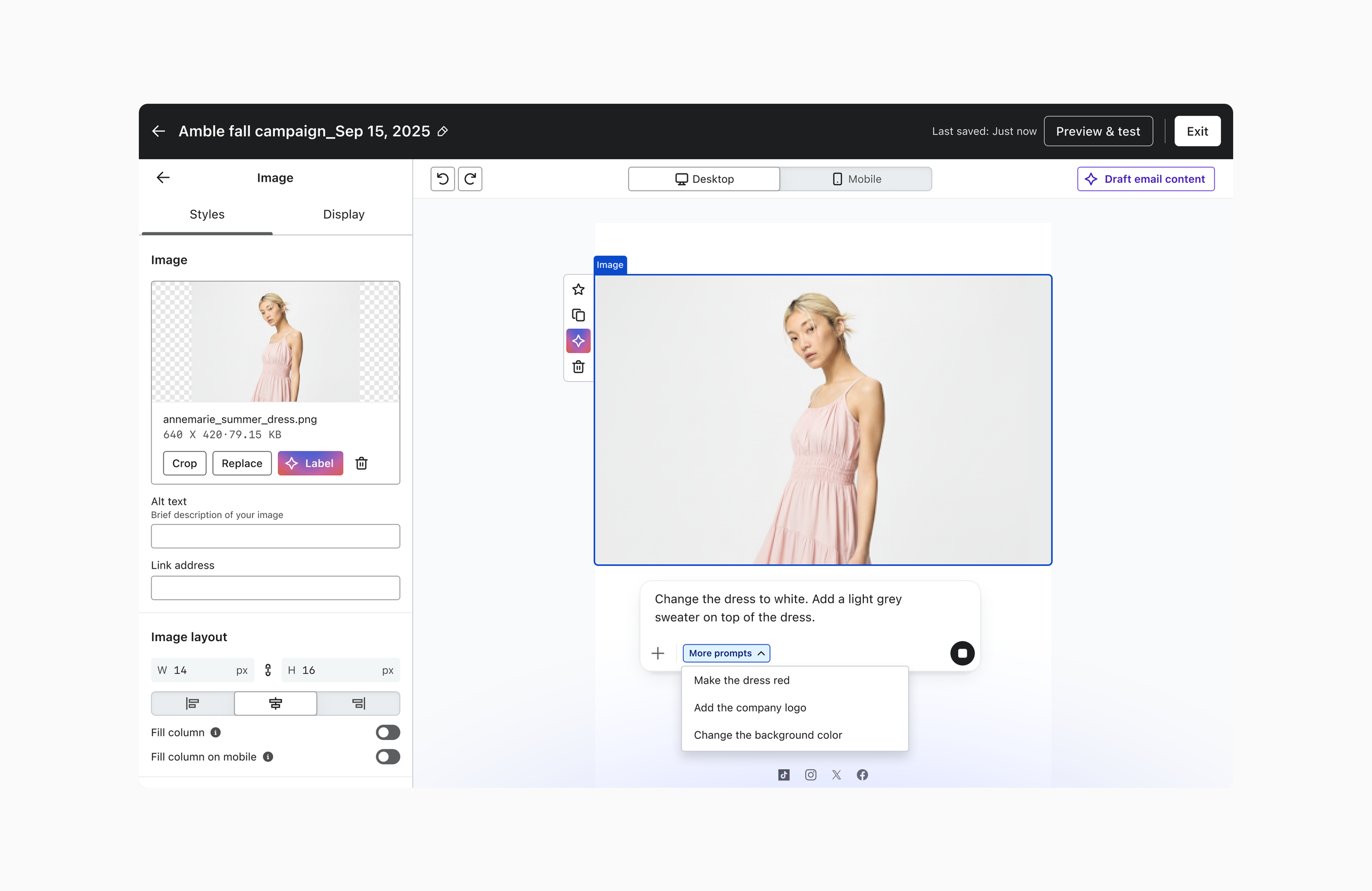
Contextual Composer: Includes leading context and creating generative content.
For image editing, Nano Banana suggests contextually relevant ideas so you're not starting from a blank slate.
The footer becomes your workspace for browsing those image prompts and uploading brand assets like logos.
Design iteration
The design process behind the Composer project
Composer overview
A summary of my collaboration with various team members across product to define the scope and explore new variations of Composer while leveraging my user research. I developed a singular component using slot architecture that can cater to diverse use cases, including a kitchen-sink version for most use cases.
Constant improvements
Adding more flexibility in to the design, particularly by incorporating a drop-down menu instead of a static footer. I envision a cascading menu that allows users to easily add images and other elements, while still keeping an open slot in the footer for additional functionalities.
The Component in React
In this video, I discuss the flexibility of our Figma component, emphasizing that you can easily integrate various elements like buttons and data tables. I highlight the potential for creating a prompt button with all the necessary states, which aligns with our design patterns.