Klaviyo Design Systems
Lead architect of the component library that powers Klaviyo
Design Systems Product Design Systems Thinking Documentation
Challenge
The Ascent Design System (ADS) is the engine behind everything we build at Klaviyo, keeping our design and code in sync so our designers can build fast with confidence. For that to work, it needs long-term stewardship to scale consistently across the product while reducing drift, tech debt, and adoption friction.
Getting universal company buy-in and creating a level of trust was a problem when I joined the team. Only 60% of the product was using the system creating a design and code bottlenecks.
My Role
Component expert for design system guidance and Office Hours.
Design lead aligning Figma with the Component Library to keep ADS up to date.
Strategic architect and the "go-to" technical authority for the entire design organization.
Solution
I’ve shaped Ascent over the past 4 years supporting teams by leading office hours, maintaining a dedicated slack channel and by leveraging AI to complete foundational modernization work across components, docs, and adoption systems.
Impact
I’ve created lasting influence across the product, via office hours and white boarding sessions with all designers in the R&D space. My documentation and creation of over 100 components in the library helped drive major system evolution including faster iteration, higher component usage, and smoother prototype-to-production flow resulting in an overall 20% yoy growth in product execution.
Design Foundations
These building blocks act as the "atomic" level of the Ascent Design System (ADS), ensuring that every component mirrors the actual codebase to maintain product integrity and a strong market position.
Tokens
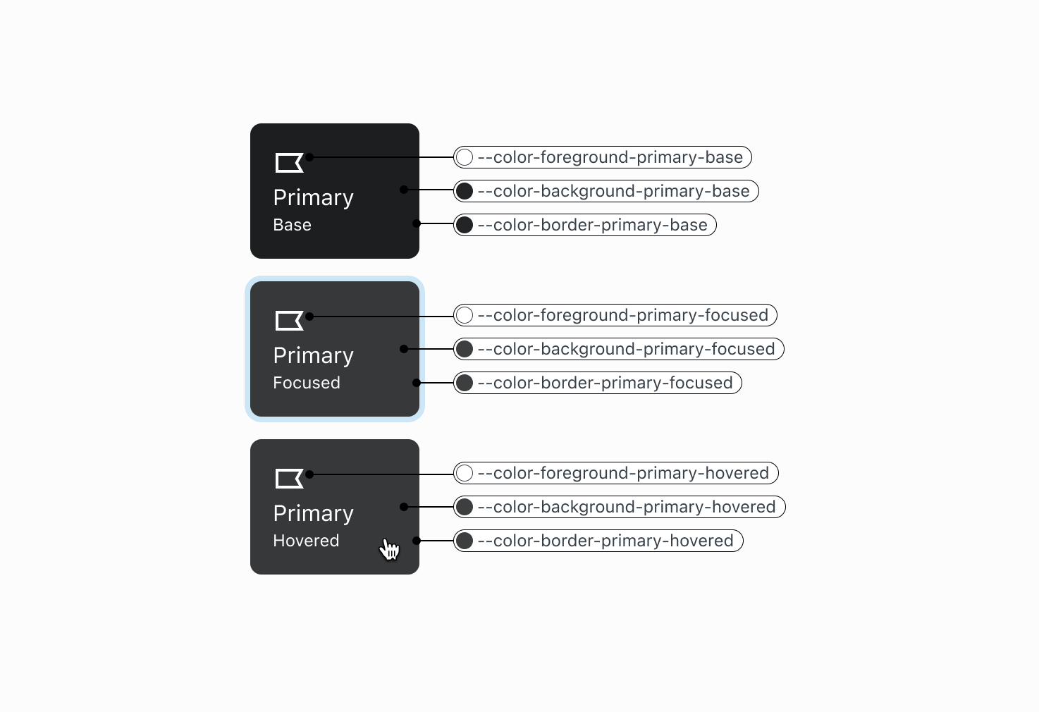
Design tokens capture design decisions, like color, typography, and spacing, in a format that’s consistent and reusable.
I’m constantly iterating and improving these token sets to support product designers continuing growth and development work.
Borders
Colors
Shadows
Typography
Spacing
Color Palette
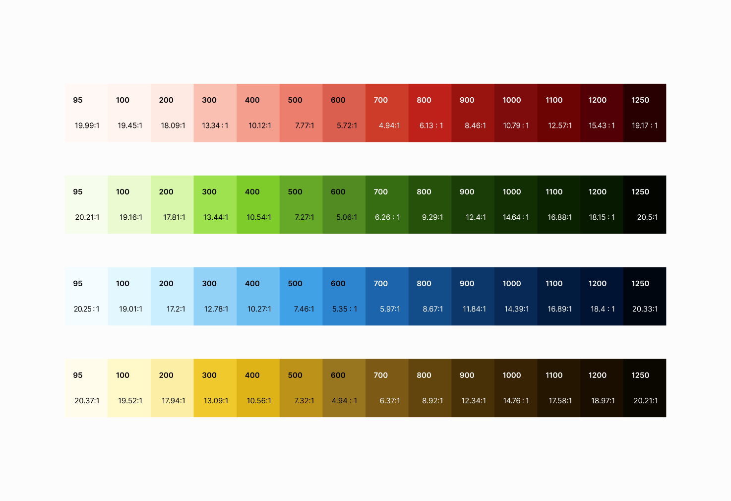
The Ascent color system provides a range that supports Klaviyo’s product branding. I build the current palette with research and much trial and error to be ADA compliant.
I work closely with other front end developers to ensure designers have beautiful and accessible colors for their work.
Icons & Illustrations
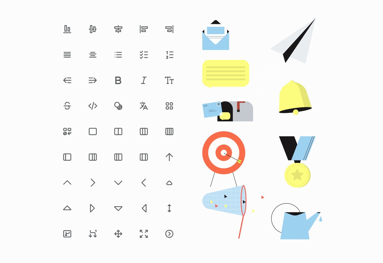
The icon system is a foundational element to ensure consistency, scalability, and technical efficiency across the platform, without depending on third party libraries.
The new illustrations are global visual representations that enhance user experiences by adding context, showcasing product features and adding visual interest.
Typography
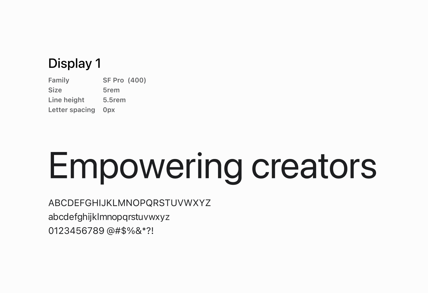
The type system is used to provide a consistent and visually appealing style for text across the application. It includes a set of pre-defined styles for headings and body text that ensure readability in any language or on any operating system.
Libraries & Components
This system is created to design and prototype with the Ascent Design System to maintain consistency and provide flexibility for experimentation while ensuring best-in-class design.
Buttons
Checkbox
Panel
Libraries
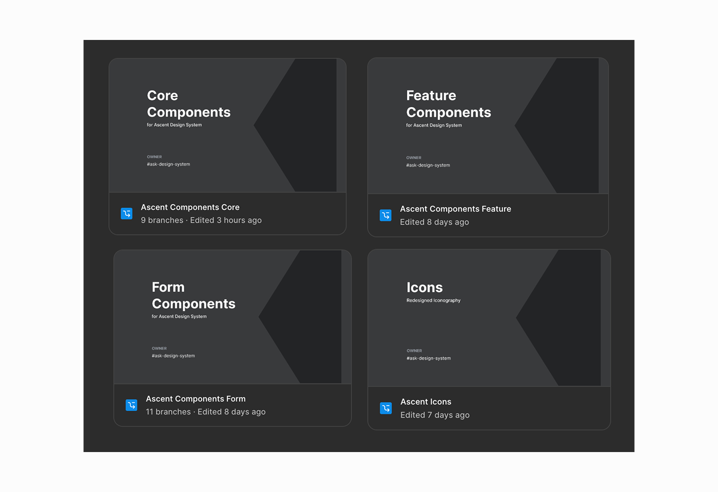
I oversee more than 15 libraries in our system that provide structure and hierarchy for developers and designers to confidently use the components and foundational elements.
Maintain and update all the components with in these libraries weekly to ensure alignment between the Figma files and React code base.
Triage and execute all design updates via Linear and Slack channels for 50+ design bugs and enhancements.
Contribute to and improve the design-to-code workflow using Figma Variables and Style Dictionary.
Core Components
Form Components
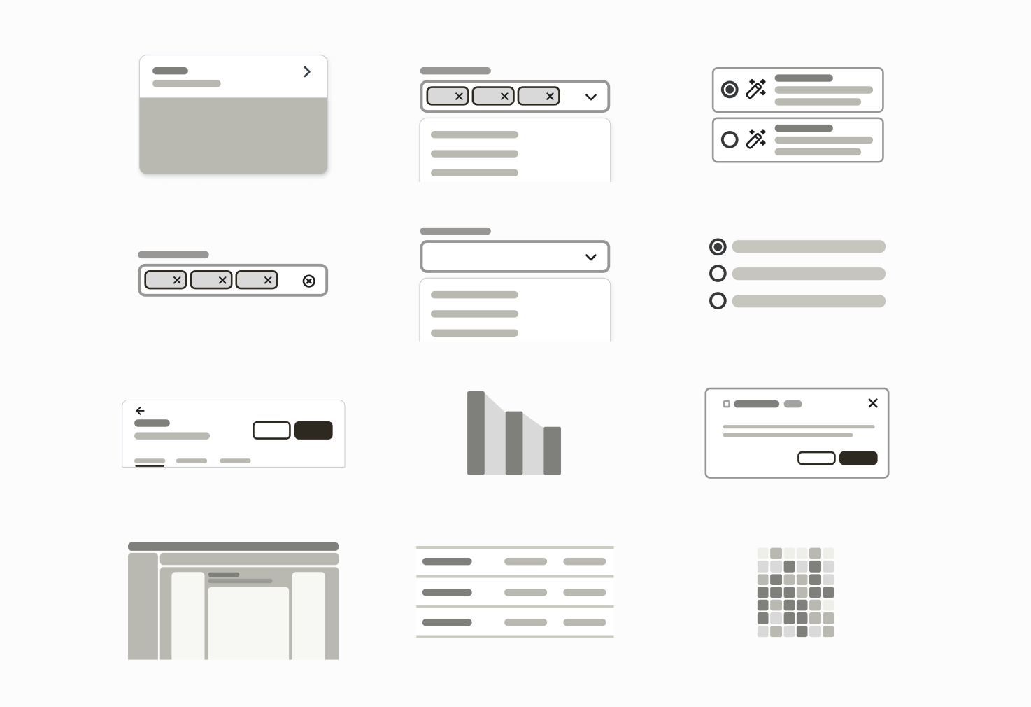
Components
As the “component librarian” I ensure Klaviyo’s product interface is secure, scalable, and efficient, maintaining a consistent visual language while pushing the boundaries of what a design system can do for modern product development.
I Contribute to and maintain over 330 components, 550 Icons.
Create and improve states and functionality for 24+ new or refactored core components.
Lead bi-weekly office hours for the entire design department where I provide expert advice on component usage, pattern work and hold whiteboard brainstorms.
Card
Editor header
Notification banners
Layout Components
Icons
Composer
Text area
Toggles
Patterns
Design Patterns provide general solutions to recurring design issues across the product.
These are a sample of current best practices I’ve recently worked on.
Container Components
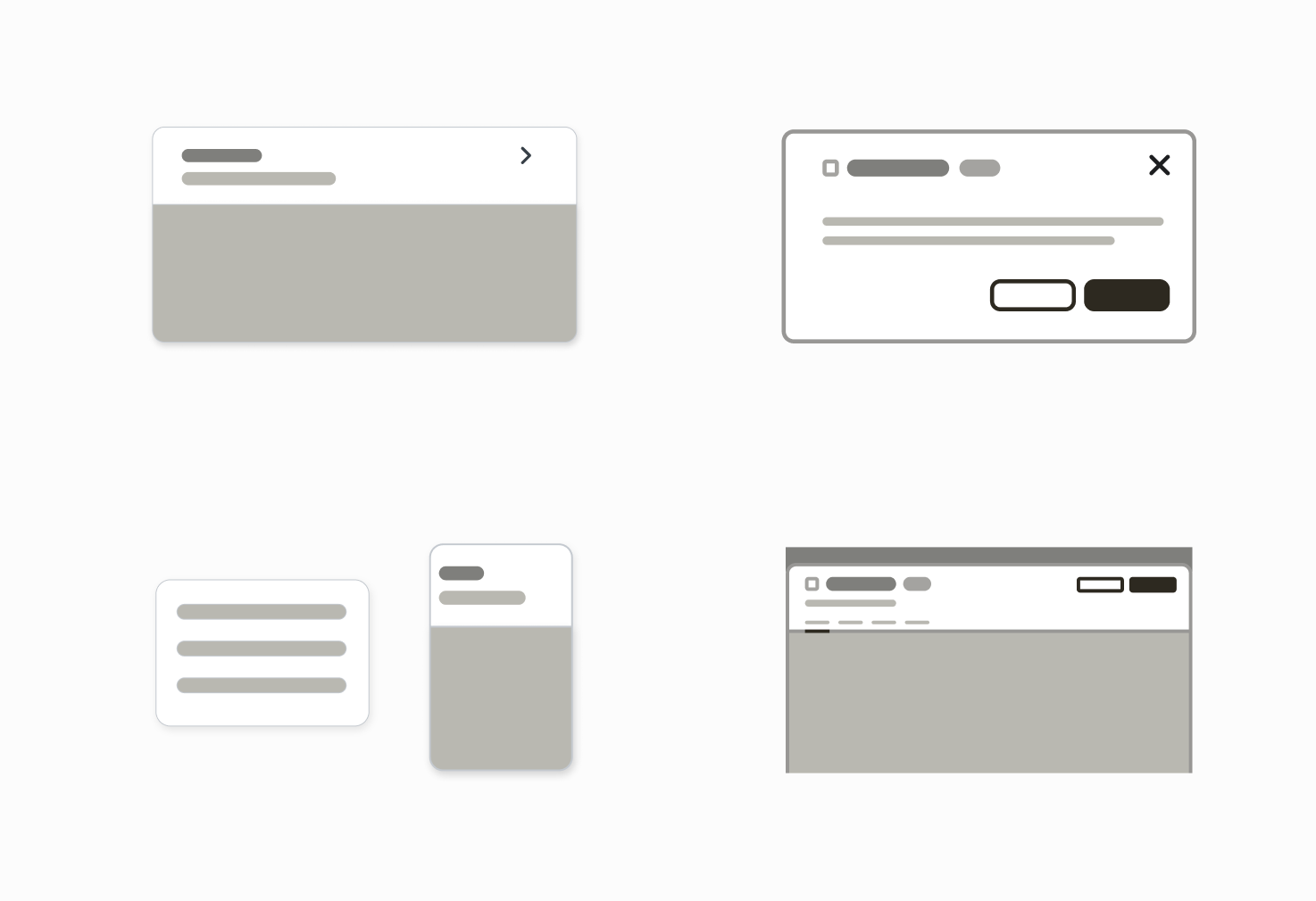
Use the decision tree to determine whether you need a Card, Drawer, Modal, or Panel.
I run a twice weekly Office Hours where these design decisions are often the primary topic of conversation.
I create these visual support documents to enable designers to feel empowered in building and exploring new user flows and layout designs.
Notifications
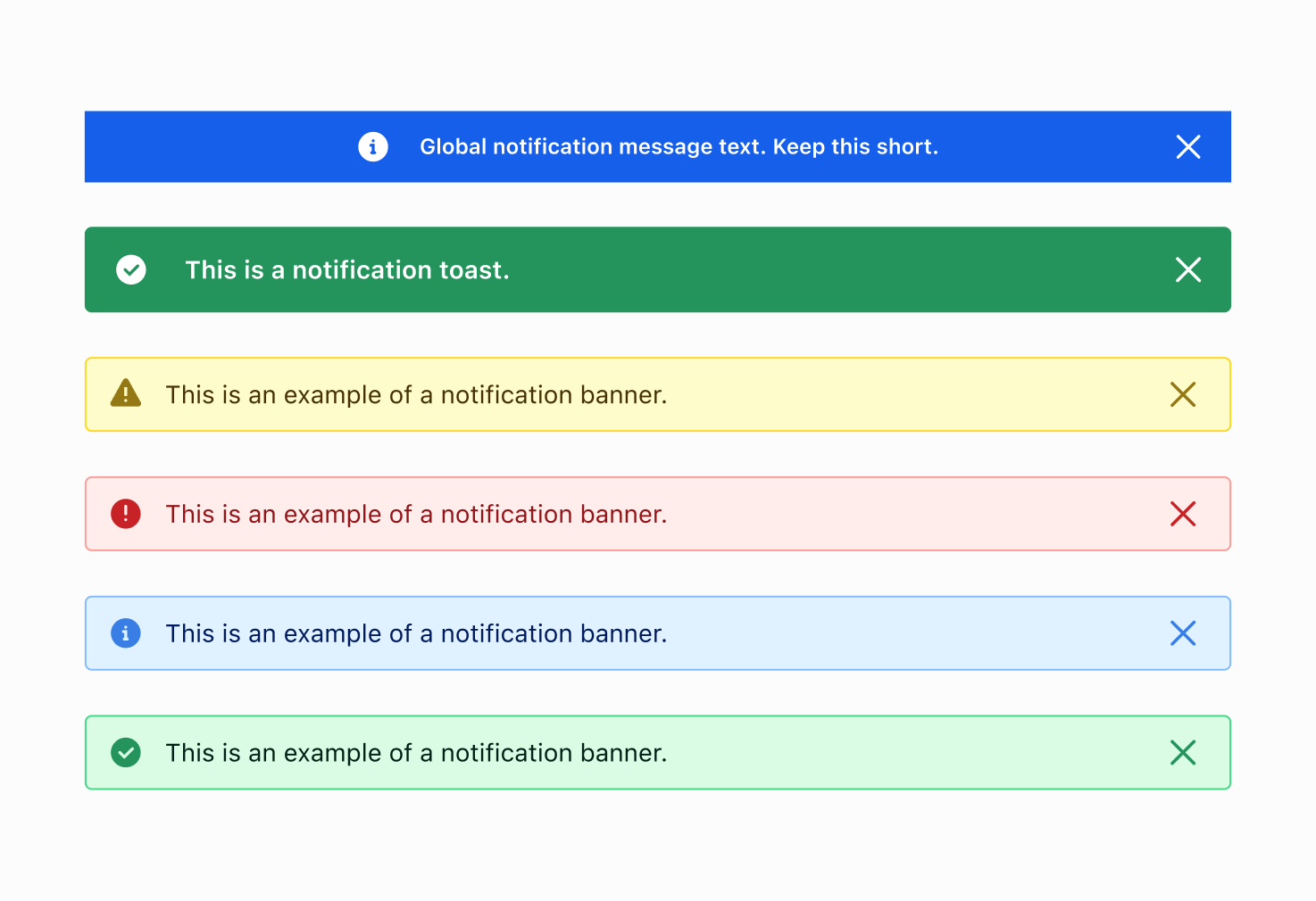
Notifications communicate system information to the user. There are many different types of UI that can deliver Notifications (like banners, toasts or modals) and some Notifications can communicate different feedback types (like error or success).
I lead design updates and documentation for all notifications
Create new ways for the notification pattern to be integrated into other components and layouts, such as Composer.
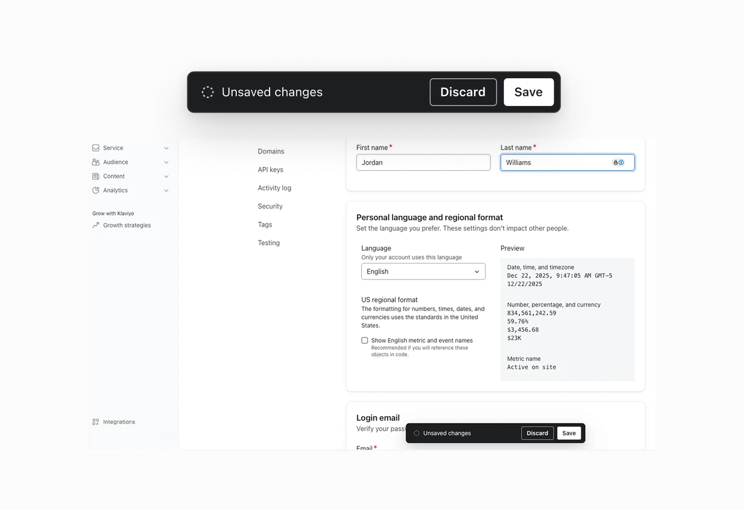
Saving
The save pattern standardizes how data is saved, ensuring a transparent and consistent experience.
Co authored this new component and pattern which supports both manual save and auto save scenarios,
This work came out of my design and systems lead work on the editor headers space and the need for better consistency and clearer contextual design.