Editor’s Library Overhaul
An example of my ability to see the big picture, take care of the details and manage multiple designers
Scalable Design User Testing Systems Thinking Technical Specification Cross-functional Collaboration
Challenge
The editor’s ecosystem was inconsistent across surfaces, creating UX fragmentation, causing repeated design and engineering rework as well as customer dissatisfaction. The makers space needed to feel cohesive and easily recognizable regardless of entry point or task at hand.
Responsiveness and a strong push for AI auditing and LM feedback were also a major focus point of this initiative.
My role
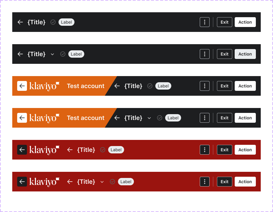
Created specifications and designs for a standardized Editor Header pattern, which is currently deployed across all core editor experiences.
Refactored functionality and design of the Editable Content component used within the header.
Lead the responsive effort and redesigned the patterns of the editors page layouts using both Claude code and Cursor to hand off POCs to engineering.
Solution
I orchestrated a systems-wide refactor to make the experience feel like a variation of the same system, thus building customer trust and satisfaction. I led the design direction for a standardized header, a new side panel component and behavior pattern, and drove rollout alignment across Forms, Email, RCS/Push, Customer Hub, Flows, Lists & Segments and Social .
This also required an new responsive grid system and radical rethinking of how a marketer could create once and adapt their vision across channels with less rework. I created a new workflow that moved away from static artifacts and dove into the code base using a collection of Claude skills, AI prototyping and Github to design and test ideas and fix paper cuts.
I used Figma as my collaboration space and created Loom videos to share out concepts, gather feedback and gain buy-in.
Impact
I shipped the new header and supporting components that standardized a widely reused pattern, supported 8 teams, resulting in an estimated 5 months of engineering time saved, and provided the Marketing Platform a safer, more scalable foundation for future improvements and agentic work for our customers.
Audit and Research
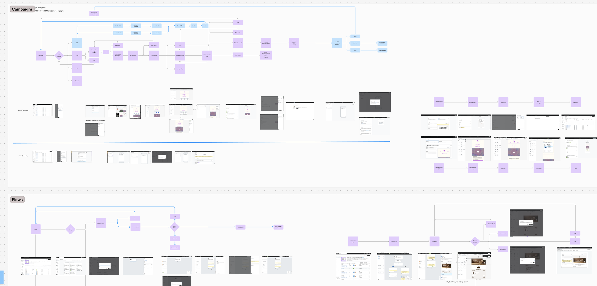
The primary challenge was that the original editor’s ecosystem did not provide a consistent user experience across all surfaces, such as editor campaigns and forms.
Editor’s Landscape
My approach involved uncovering user patterns patterns and clearly defining opportunities for consistent navigation, actions, and responsiveness across multiple creation spaces within the application.
Design Iteration
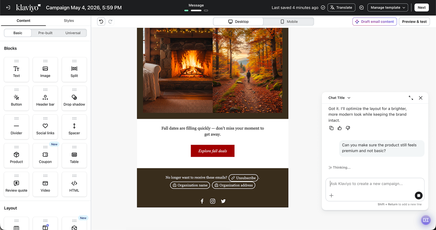
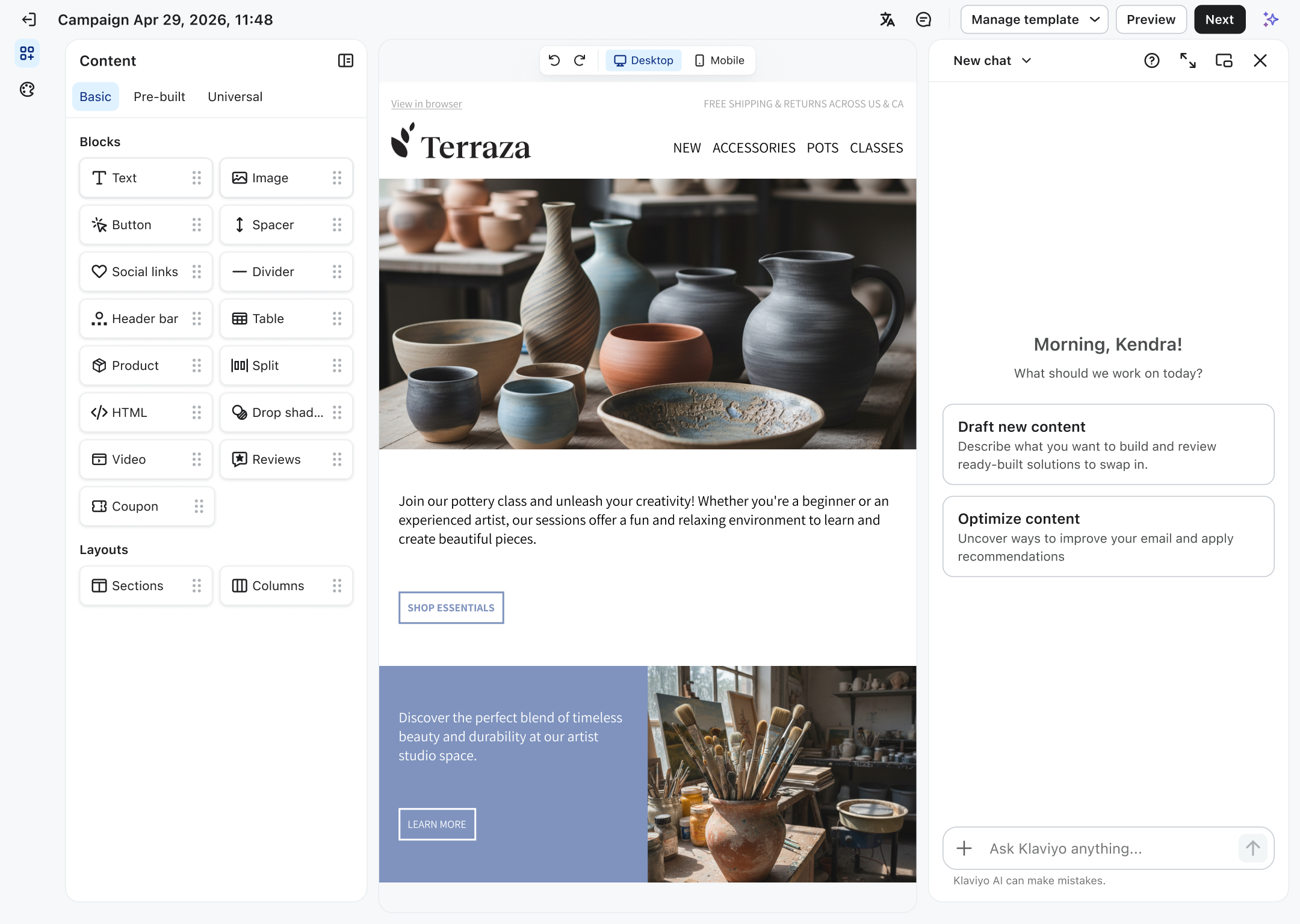
The project was not just a visual cleanup — it standardized the foundation for responsive layout, dual view, composer/chat integration, and faster cross-team delivery.
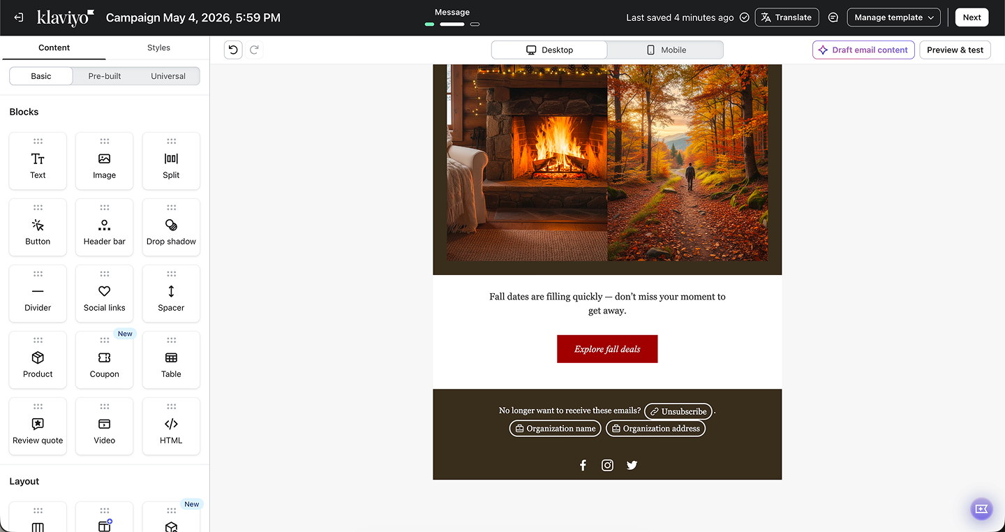
Before
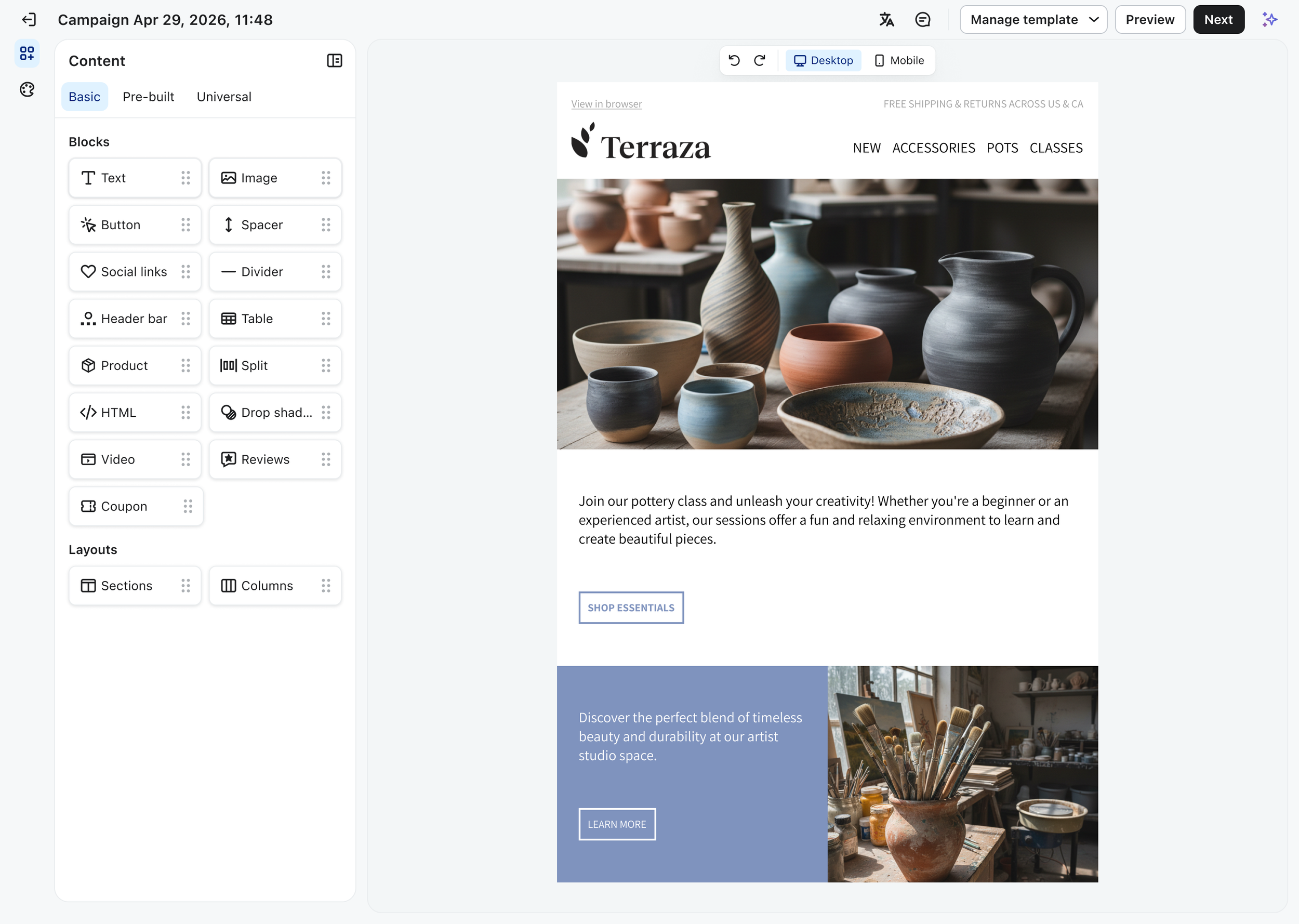
After
Before
After
Before
After
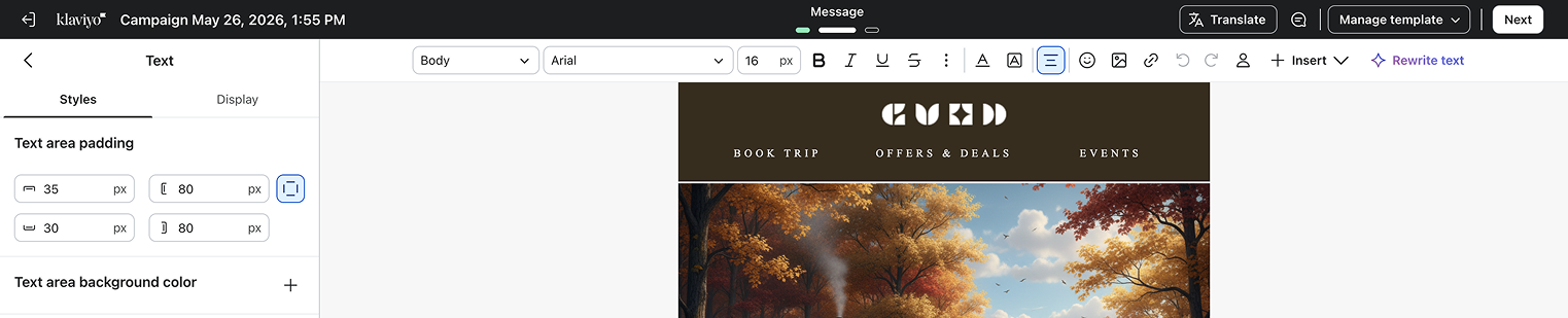
Before
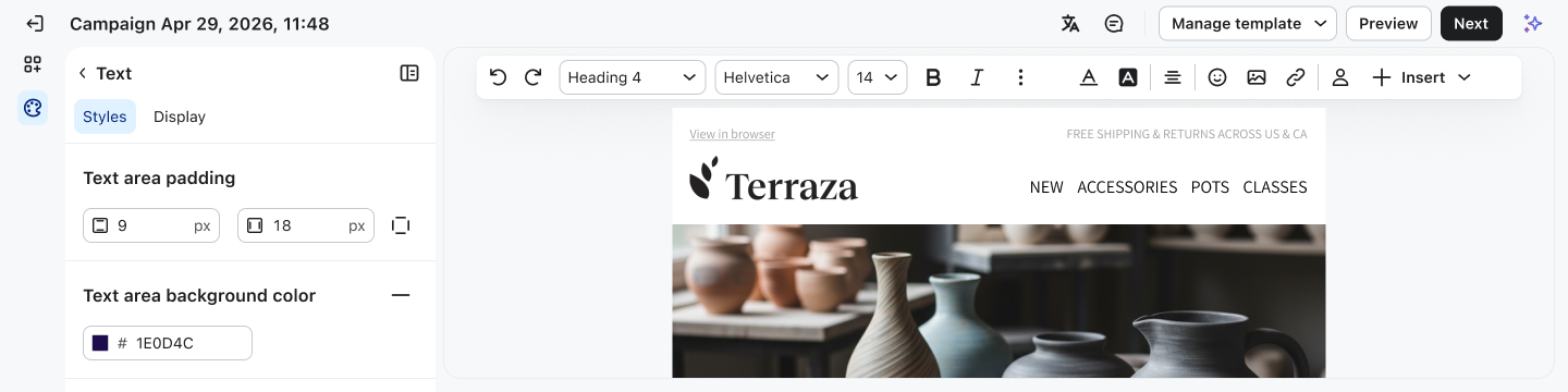
After
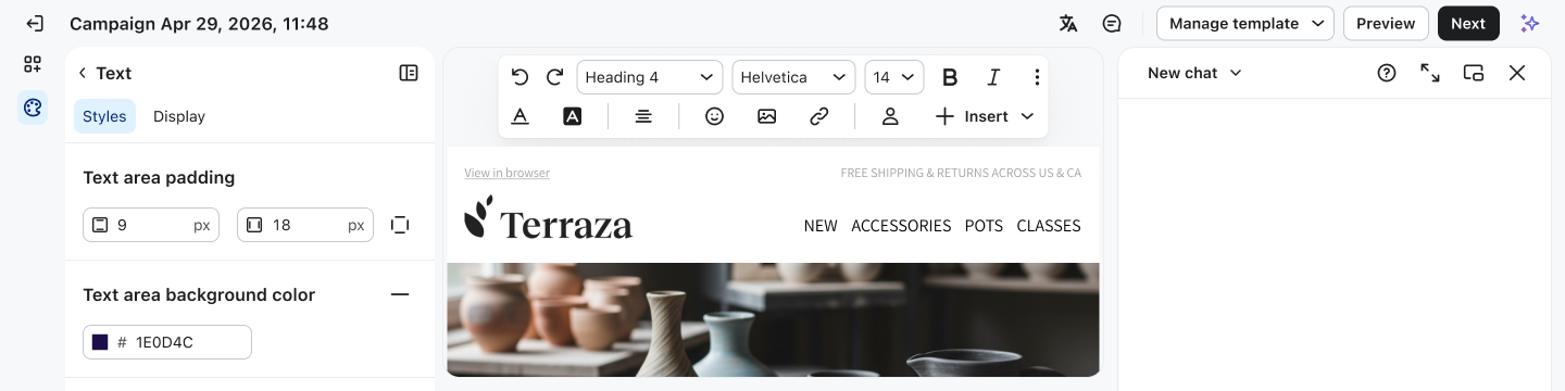
After | Responsive wrapping
UX Unification
UX unification: standardize the header, left panel behavior, canvas controls, AI chat entry point, and preview patterns across channels.
Ascent foundation work: migrate shared UI out of the editors library and into back into Ascent to enable better distribution of components and patterns.
Editor Header
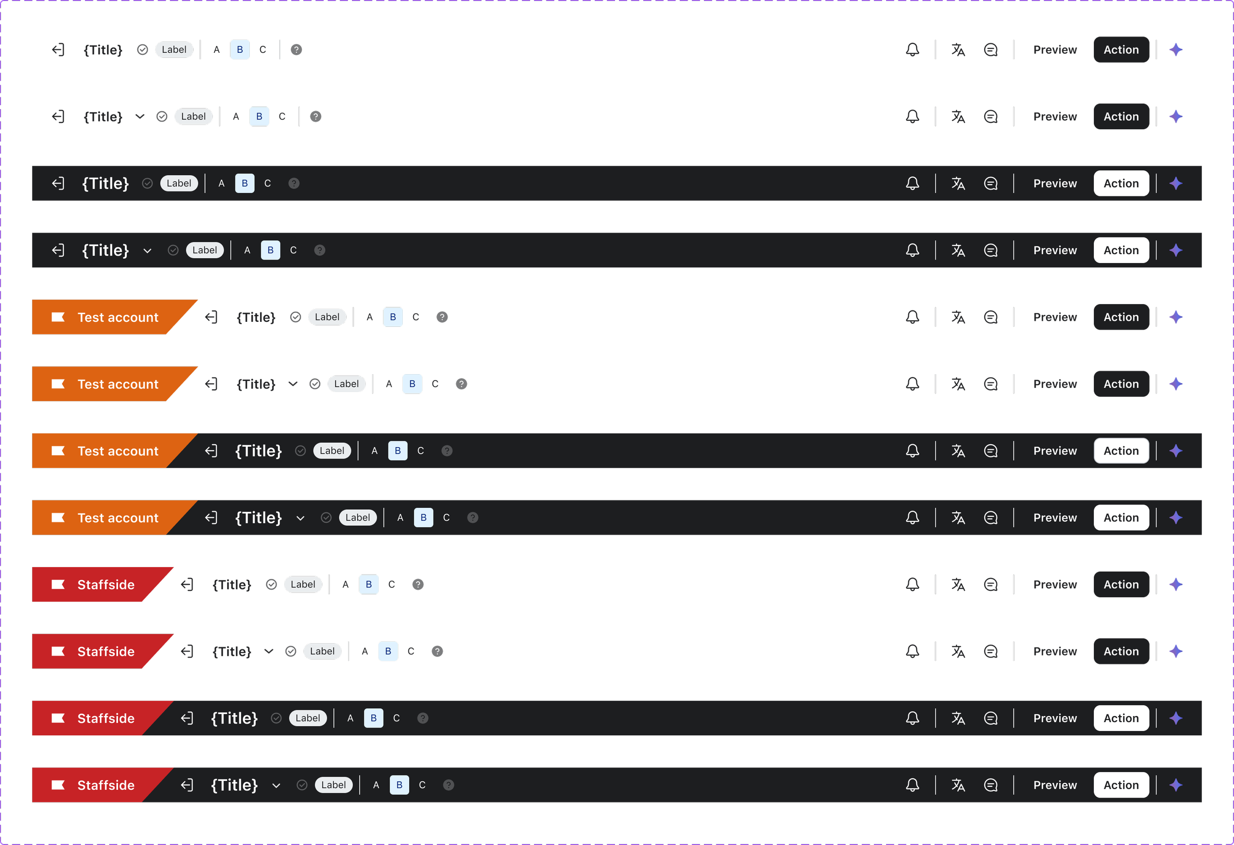
The new header creates a single, reusable pattern across editors with consistent zones, channel variants, responsive overflow behavior, inline title editing, and a clearer placement for status and save feedback.
It also pulls important actions like Preview & Test into the header and establishes a dedicated slot for the Composer/chat entry point, making the header more scalable for future AI workflows.
Action Bar
The action bar turns those secondary controls into a consistent, intentional surface. Instead of scattered triggers, it provides a reusable container for grouped controls and supports a cleaner floating pattern for step-based secondary navigation, especially in the editor/forms overhaul.
Chat Container
The new layout gives chat a dedicated right-side container/panel, so it becomes part of the editor architecture rather than an overlay afterthought. This makes the experience more stable, more scalable, and better suited to real-time AI-assisted workflows alongside the canvas.
Side Bar Menu
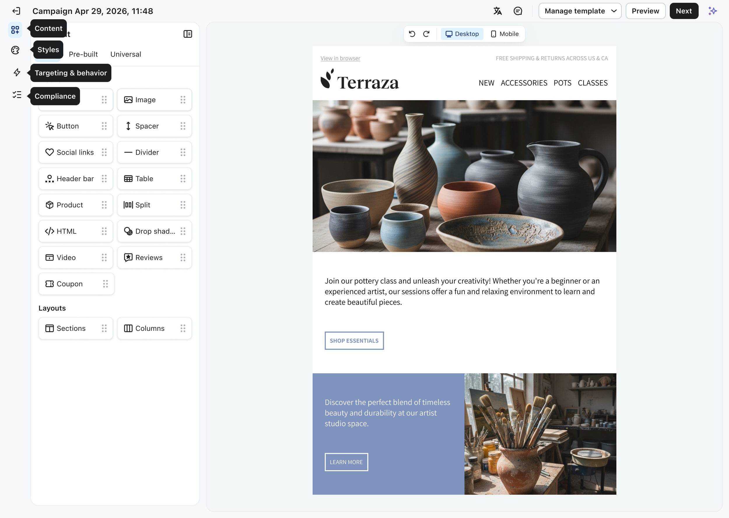
The redesigned sidebar becomes a clearer, collapsible navigation system that groups work into focused sections like Content, Styles, and Targeting & Behavior.
It reduces visual noise, moves controls into a more structured left-rail pattern, and creates a more scalable foundation for editor tools and AI-related panel access.
Execution
User can create once and adapt across channels without rework because creating campaigns and forms feel like variations of the same system. Designers and engineers can now build faster because foundations are shared.

Tokens
Design tokens capture design decisions, like color, typography, and spacing, in a format that’s consistent and reusable. These include:
Borders
Colors
Shadows
Typography
Spacing
Color Palette
The Ascent color system provides a range of colors that supports Klaviyo’s product branding. The current palette was built with research and much trial and error. Below is more details about the process and how the color palette was built.
Icons & Illustrations
The icon system within the Ascent Design System is a foundational element to ensure consistency, scalability, and technical efficiency across the platform, without depending on third party libraries.
The new Illustrations are visual representations that enhance user experiences by adding context, showcasing product features and adding visual interest.
Typography
The type system is used to provide a consistent and visually appealing style for text across the application. It includes a set of pre-defined styles for headings and body text.